Wall to Wall is a brand design agency with two locations one in Pittsburgh and one in Honolulu. Founded in 1992, they reach a wide scope of design mediums in creating branding identities. Everything from web design to print design is explored in the company made of hand-picked, hybrid individuals who excel technically and artistically. They seek to emotionally embody the goals of each company as they craft their brands.[1] One of their clients is the Carnegie Museum of Art who they created a branding identity for before creating an advertisement series for LIGHTIME.
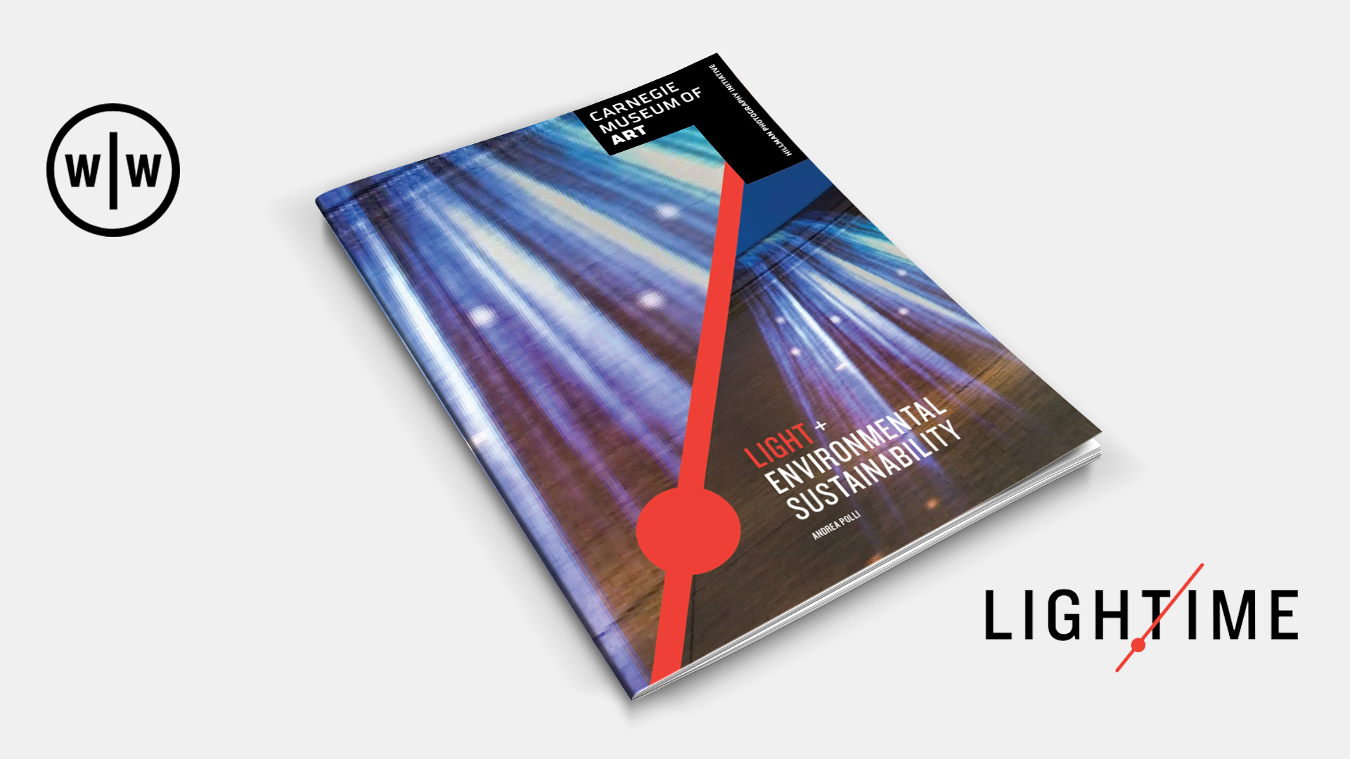
LIGHTIME is a yearlong photography exhibit on display at the Carnegie Museum of Art. LIGHTIME uses the camera’s measurement of light and time to explore modern social issues. Wall to Wall Studios created a variety of advertisements and print design pieces for the exhibit. In the following advertisements Wall to Wall uses a variety of techniques to entice viewers to visit the exhibit.
The LIGHTIME ads all appeal to the emotions and personalities of those in their audience and they look to inform the viewer as well as entice them to come see the show. The ads also use imagery to show some of the works that are included in the series and a personality symbol is featured across all four. The red line that cuts across the ad separating the image from the text information is the branding mark that is also featured in the LIGHTIME exhibit logo. It represents a clock arm as well as a beam of light as it cuts across the logo and the ads.[2] The text shown below the image utilizes testimonials from various artists. They both help to explain the works’ connections to the social issues and explain what the exhibit seeks to explore.

In this case using scientific reasoning, dramatization, or a factual message would draw away from the meaning of the art and its messages. Any of those tactics would most likely offend the advertisement’s main audience and cause the ad to be unsuccessful.
The visual elements of the ads entice creative types to value the ad more than they would value an all text advertisement. Analytical types are also drawn to the ad because it offers some body text to provide information rather than solely relying on imagery. Wall to Wall also utilized a red line to tie the ad back to the larger identity of the museum which helps appeal to those who are emotionally bonded to the Carnegie Museum of Art.
This ad is effective in appealing both to the analytic types who may have an interest in the exhibits’ social issues as well as the creatives who have an interest in the photographic pieces and their representation of the social issues they cover. It effectively utilizes imagery and testimonials to both entice and inform its viewers. Wall to Wall was also able to reach out to those brand loyal to Carnegie Museum of Art by using the same red color featured in their logo identity.
[1] https://www.walltowall.com/pages/company
[2] https://www.walltowall.com/pages/carnegie-museum-of-art